Subway pattern – GCWeb design system
The subway navigation pattern helps people do what they need to do. It does this by presenting content as a series of related tasks broken down into steps.
The subway pattern is ideal for helping people understand, determine their eligibility, and apply for products or services.
On this page
When to use
Only use the subway pattern to guide the user through a series of related tasks.
For example, use the subway pattern:
- To break up long and complex content over a group of related pages
- To provide persistent navigation that follows the user journey through a series of tasks related to a product or service
What to avoid
- Do not use the subway pattern for any reason except to guide the user through a series of related tasks
- Do not misuse the subway patterns because this:
- Creates inconsistency from one subway product to another across Canada.ca
- Risks breaking the following principles:
Content and design
The subway pattern is a set of different page types. Each subway page type has its own role, rules and design specifications.
To use the subway pattern correctly:
-
Understand the subway page types
There are 3 page types within the subway pattern:
- Index page (required)
- Step page (required)
- Sub-page (optional)
This means the subway pattern has a minimum of 2 levels of information architecture (IA). The pattern can grow to support 3 levels of IA, if needed:
-
First level (mandatory):
Index page -
Second level (mandatory):
Step pages -
Third level (optional):
Sub-pagesIf a section of content is too complex or varied for a single step page, you can create a sub-page for that content.
There are 2 types:
-
Non-connected sub-page
-
Connected sub-page
Determining which sub-page type to use depends on the content you have.
Refer to: Create sub-pages, if needed
-
Subway pattern in mobile
On step pages and sub-pages, the subway pattern code defaults to mobile first. The mobile design automatically transforms into a new design when on a desktop. However, for reference, this document shows mostly desktop screenshots.
The main design differences are:
Mobile
- Subway menu location
- Placed at the top of the page, directly below the breadcrumbs
- Subway wrapping container
- The subway line extends to create a border surrounding the entire subway menu, including the first
h1 - "Sections" label
- Hidden on mobile
- Uses 2 main headings (
h1) -
Most pages on Canada.ca have only one
h1. However, the step page and sub-page have 2h1s:- First
h1: Placed directly above the subway menu, forming part of the surrounding border that wraps the subway menu - Second
h1: Placed after the subway and has the same appearance as anh1on any other page on Canada.ca
- First
Desktop
- Subway menu location
- Placed to the right of the content area, in it's own column
- Subway wrapping container
- None
- "Sections" label
- Placed directly above the subway menu
- Uses 2 main headings (
h1) -
Most pages on Canada.ca have only one
h1. However, the step page and sub-page have 2h1s:- First
h1: Placed on the left side of the page, as smaller grey text that is directly above the secondh1 - Second
h1: Placed on the left side of the page, directly above the content area and has the same appearance as anh1on any other page on Canada.ca
- First
-
Determine the structure and flow of content
The flow of content across the subway pages should follow a logical progression. It should reflect the user journey and represent a "happy path".
The "happy path" starts with the basic details and then moves the user through the process in a clear and logical path. The "happy path" is as follows:
- Introduce the product or service
- Explain who it's for
- Explain what core activity the user has to do
- Explain any follow-up activities
- Provide contact details (optional)
-
Introduce the product or service
Create a brief introductory statement that explains what the product or service is.
-
If it's easy to describe
The introductory statement goes on the index page.
It is a short paragraph or 2, and is the first thing to appear on the index page, above the subway menu.
Live examples:
-
If it's complicated to describe
Sometimes the product or service is too complex to reasonably describe on the index page. If this is the case, include a high-level description on the index page and use the first step page in the subway menu to provide more detail.
Use the recommended wording:
- What is the [product or service name]
- What are [product or service name]
Live examples:
- Disability tax credit (DTC) (index page)
- What is the DTC (first step page)
- Scientific Research and Experimental Development (SR&ED) tax incentives (index page)
- What are SR&ED tax incentives (first step page)
-
-
Explain who it's for
This is often where eligibility information goes.
- Identify the eligibility criteria. If possible, use the recommended wording (choose one):
- Who can apply
- Who can claim
- Who can file
- Who is eligible
"Who is eligible" should rarely be used
Use the plain language terms "apply" or "claim" instead of "eligible". Only use "eligible" in rare situations when the other terms might cause user confusion.
- Who must register
- Provide extra information. If possible, use the recommended wording (as needed):
- How much you can get
- Periods you can apply for
- Expenses you can claim
- Which of your employees qualify
- Identify the eligibility criteria. If possible, use the recommended wording (choose one):
-
Explain what core activity the user has to do
This page contains the core activity of a product or service. The core activity typically involves calculating, applying, claiming, registering, filing or submitting.
- Prepare for the core activity. If possible, use the recommended wording (choose one):
- Get ready to apply
- Get ready to claim
- Get ready to file
- Get ready to register
- Give timelines. If possible, use the recommended wording (choose one):
- When to apply
- When to claim
- When to file
- When to register
- Provide assistance. If possible, use the recommended wording:
- Calculate your [x]
- How to complete the core activity. If possible, use the recommended wording (choose one):
- How to apply
- How to claim
- How to file
- How to register
- Prepare for the core activity. If possible, use the recommended wording (choose one):
-
Explain any follow-up activities
This page contains the activities that happen after the core activity has been done.
- Explain what happens after. If possible, use the recommended wording (choose one):
- After you apply
- After you claim
- After you file
- After you register
- Post application tasks or information. If possible, use the recommended wording (as needed):
- Validating your application
- Our review and decision
- When and how to get your payment
- Impact on your [x]
- Change or cancel your claim
- Change or manage your account
- Return a payment
- Keep getting your payments
- Explain what happens after. If possible, use the recommended wording (choose one):
-
Provide contact details (optional)
If there are specific phone numbers or mailing addresses associated with the product or service, it is optional to create a contact page.
If possible, use the recommended wording:
- Contact us
-
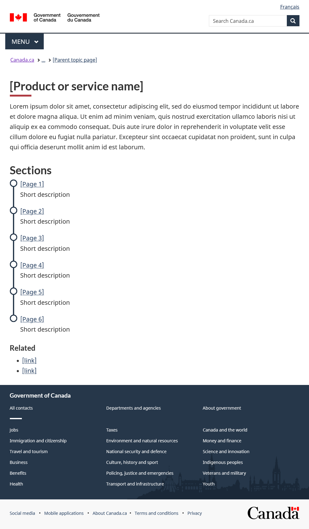
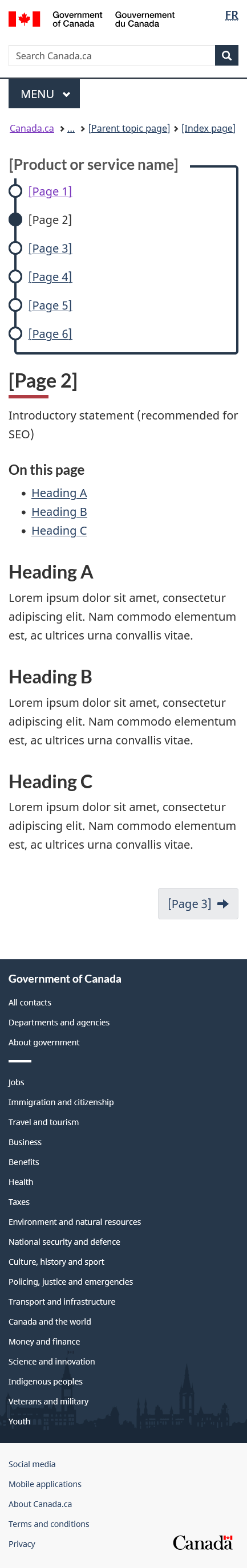
Create the index page
This is the main landing page for the product or service. Use this page to introduce the step pages.
h1heading-
The
h1heading on the index page is the main heading for the product or service. The heading you choose will automatically be repurposed as the page'stitletag, which is an invisible tag that search engines use for their search results.To have quality search engine results, the
h1on the index page must be 100% unique within the entire Government of Canada. A uniqueh1ensures that a search engine will display meaningful results, and not show links that seem to compete with or overlap each other.Your heading must also be clear. If it's vague, it risks confusing the user. Other pages on Canada.ca may have similar headings, causing those pages to also appear in the user's search results.
For clarity, make the heading unique enough that it doesn't overlap or duplicate any current or future page another department or agency creates.
Typically the subway pattern is applied to a product (a noun). In those cases, there is less chance of other Government of Canada pages showing up in search results and competing with your content.
For example:
However, when a subway's index page is designed around a task (a verb), the heading can often be too vague because a task can be common across several departments and agencies. In this situation, be sure to make your heading specific.
For example:
- Write: Register for a payroll account
- Don't write: Register for an account
- Breadcrumb
-
- The last link in the breadcrumb path must be the IA parent page of this index page
- The parent page must also feature a link back to the subway index page, to ensure the index page is not orphaned
Format: Canada.ca > ... > [Parent topic page]
- Content area
-
- Must include a brief description of the product or service directly below the
h1 - Must include a subway menu that includes both the:
- Link to each step page
- A short description (doormat) of what that step page is about
- May include supporting links (optional) to products or pages outside the subway menu.
- Must include a brief description of the product or service directly below the
- Navigation menu
-
- Must be displayed in the main content area, below the introduction
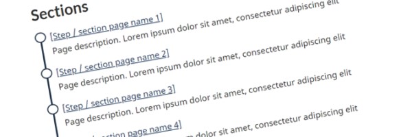
- Has a header called "Sections"
- Must contain the links to the subway step pages
-
Link text should be as concise as possible, as the double
h1design that appears on the subsequent step pages carries over the name of the product or serviceFor example:
- Write: How to apply
- Don't write: How to apply for the Disability Tax Credit (DTC)
-
- Must have a reasonable number of links (aim to have between 3 and 8 links)
- Must only link to the second level of IA
- Must link to pages that have the corresponding subway menu, as no link can take the user outside the subway menu
- Must include descriptive doormat for each link following the doormat link description rules
- Supporting links
-
- Use sparingly or avoid whenever possible, as they can distract a user from their task
- Must apply to the entire product or service
- Must appear below the subway menu, under its own heading called "Related information"
- If there are several supporting links and they can be bundled together into groups, you can create additional headings to introduce each group instead of using the singlar "Related information" heading
- Pagination buttons
-
- Backwards button:
- None, since this is the root page for this product or service
- Forwards button:
- None, since the user should make a choice from the subway menu that is prominently featured in the content area
- Backwards button:
titletag-
Format:
<title>[Product or service name] - Canada.ca</title>
Appearance and code
Appearance
[Product or service name]
Lorem ipsum dolor sit amet, consectetur adipiscing elit, sed do eiusmod tempor incididunt ut labore et dolore magna aliqua. Ut enim ad minim veniam, quis nostrud exercitation ullamco laboris nisi ut aliquip ex ea commodo consequat. Duis aute irure dolor in reprehenderit in voluptate velit esse cillum dolore eu fugiat nulla pariatur. Excepteur sint occaecat cupidatat non proident, sunt in culpa qui officia deserunt mollit anim id est laborum.
Code
<main> <h1 property="name" id="wb-cont" class="gc-thickline">[Product or service name]</h1> <p>...</p> <!-- Navigation menu --> <nav class="gc-subway provisional"> <h2>Sections</h2> <dl> <dt><a href="#">[Page 1]</a></dt> <dd>Short description</dd> <dt><a href="#">[Page 2]</a></dt> <dd>Short description</dd> <dt><a href="#">[Page 3]</a></dt> <dd>Short description</dd> <dt><a href="#">[Page 4]</a></dt> <dd>Short description</dd> <dt><a href="#">[Page 5]</a></dt> <dd>Short description</dd> <dt><a href="#">[Page 6]</a></dt> <dd>Short description</dd> </dl> </nav> <!-- Supporting links --> <aside> <h2 class="h3">Related information</h2> <ul> <li><a href="#">[link]</a></li> <li><a href="#">[link]</a></li> </ul> </aside> </main> -
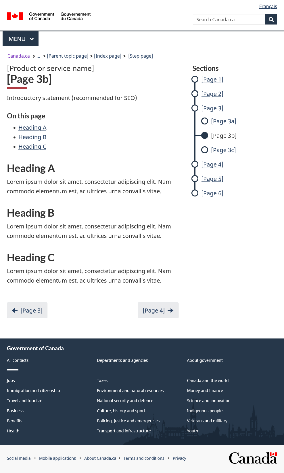
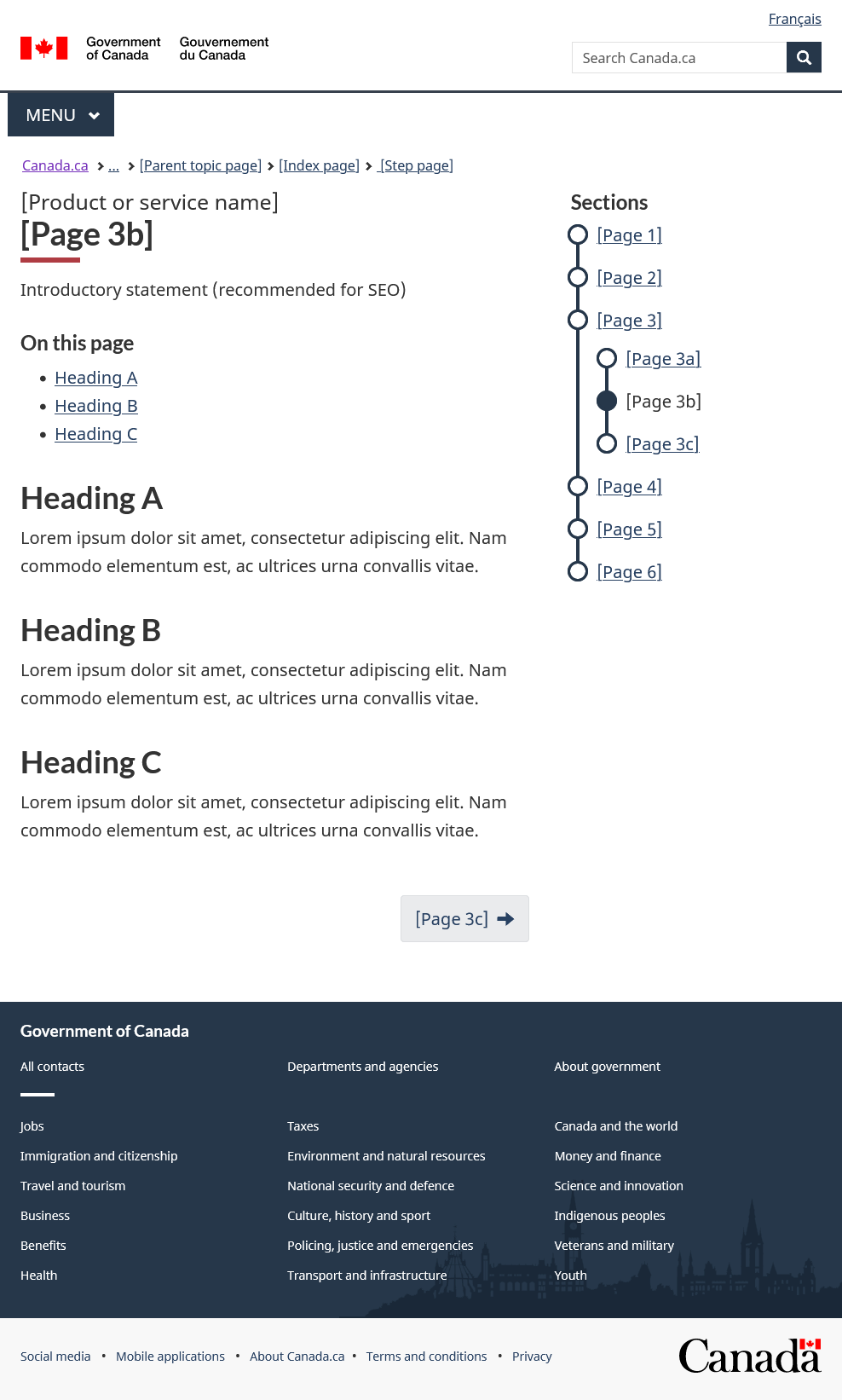
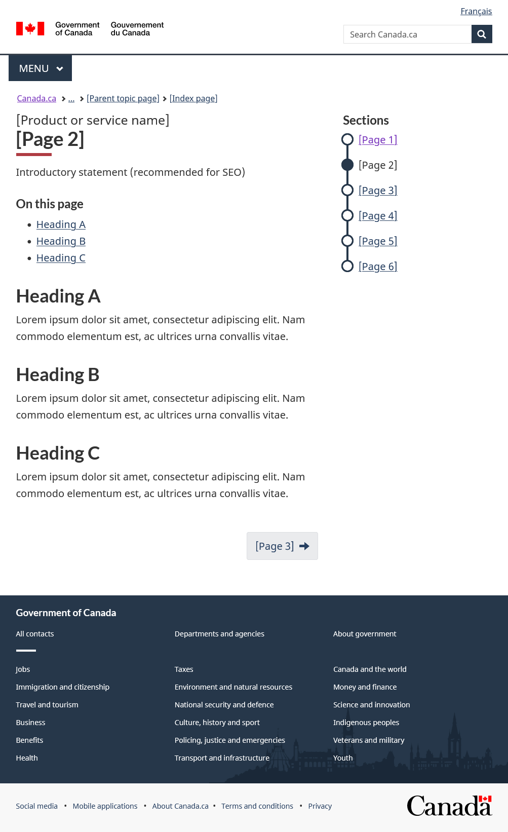
Create step pages
Use the step page pattern on each page that is part of the second level of the subway pattern IA.
h1headings-
- First
h1heading: This is the smaller dark grey heading that must match theh1on the index page -
Second
h1heading: This is the larger black heading that:- Corresponds to the link names in the subway menu
- Focuses on a specific task for that page
- Does not typically repeat the product or service name already mentioned in the first
h1
The concept of having 2
h1s is documented in Service Canada's: Design decision 12 - Double H1 on a single page - First
- Breadcrumb
-
The index page must be the parent page in the breadcrumb
Format: Canada.ca > ... > [Parent topic page] > [Index page]
- Content area
-
Everthing in the content area must adhere to:
- Writing rules
- Design system components for styling
When there is a table of contents on the page, consider placing a simple page summary immediately below the second
h1heading. This can help a search engine algorigthm correctly describe the page in the search results. - Navigation menu
-
- It is a condensed version of the navigation menu on the index page, featuring only the links and without the doormat link descriptions
- The active (current) page is indicated in the menu by a solid filled circle, and a disabled hyperlink
- Links only to other pages in the second level of the IA that have the same subway menu (you can't link to pages outside the subway menu from a subway link)
- Supporting links
- Appear within the content area, in the body of the text at the point of need
- Pagination buttons
-
- Backwards button:
- Do not use a backwards button as the goal is to move people forward to the next step in the user journey
- Forwards button:
- Position on the bottom right of the content area
- Include a right arrow icon after the link text
- Link to the next step page (if this is the last step then do not include any forward pagination)
- Backwards button:
titletag-
Format:
<title>[Step page] - [Product or service name] - Canada.ca</title>In AEM, the title tag will need to be manually adjusted in the properties tab to include both the product or service name, and the current page title
Appearance and code
Appearance
[Product or service name]
[Page 2]
Introductory statement (recommended for SEO)
On this page
Heading A
Lorem ipsum dolor sit amet, consectetur adipiscing elit. Nam commodo elementum est, ac ultrices urna convallis vitae.
Heading B
Lorem ipsum dolor sit amet, consectetur adipiscing elit. Nam commodo elementum est, ac ultrices urna convallis vitae.
Heading C
Lorem ipsum dolor sit amet, consectetur adipiscing elit. Nam commodo elementum est, ac ultrices urna convallis vitae.
Code
<main> <!-- Navigation menu and first H1 --> <nav class="gc-subway provisional"> <h1>[Product or service name]</h1> <ul> <li><a href="#">[Page 1]</a></li> <li><a href="#" class="active">[Page 2]</a></li> <li><a href="#">[Page 3]</a></li> <li><a href="#">[Page 4]</a></li> <li><a href="#">[Page 5]</a></li> <li><a href="#">[Page 6]</a></li> </ul> </nav> <!-- Second H1 --> <h1 property="name" id="wb-cont" class="gc-thickline">[Page 2]</h1> <!-- Page content --> <p>Introductory statement (recommended for SEO)</p> ... <!-- Pagination --> <nav class="gc-subway-pagination"> <h2 class="wb-inv">Document navigation</h2> <ul class="pager"> <li class="next"><a href="#" rel="next"><span class="wb-inv">Next: </span>[Page 3]</a></li> </ul> </nav> </main> -
Create sub-pages, if needed
Sub-pages are an optional page type that can be added when you need to break up a large step into smaller items or to outline a side journey for specific audiences that relate to the main step.
There are 2 types of sub-pages:
-
Non-connected sub-page
Use this navigation when the sub-page tasks only relate to the parent step, but not to each other:
-
Connected sub-pages
Use this navigation when the sub-page contains items that must be done in an specific ordered way to complete the goal of the parent step:
-
Determine how the sub-page links will display on the step page
Step pages that contain sub-pages have a different content area design than regular step pages. The main focus of the content area is to provide navigation to the sub-pages.
There are 3 ways to display the navigation on the step page:
-
As tiles
Use when there is no sequential order to the sub-pages:
- Use the grid system with doormats to link to the sub-pages
- Do not include any pagination buttons, as the user should make a choice from the navigation links that are prominently featured in content area
- Sample:
[Link 1]
Short description
[Link 2]
Short description
[Link 3]
Short description
[Link 4]
Short description
View code
<div class="wb-eqht row">
		<div class="col-md-6">
			<h3><a href="#">[Link 1]</a></h3>
			<p>Short description</p>
		</div>
		<div class="col-md-6">
			<h3><a href="#">[Link 2]</a></h3>
			<p>Short description</p>
		</div>
		<div class="col-md-6">
			<h3><a href="#">[Link 3]</a></h3>
			<p>Short description</p>
		</div>
		<div class="col-md-6">
			<h3><a href="#">[Link 4]</a></h3>
			<p>Short description</p>
		</div>
	</div>
-
As a numbered list
Use to create a step-by-step sub-process for content that is best viewed in a sequential order:
- Introduce with the heading "Steps"
- Use stylized steps that include doormat link description text
- Do not include any pagination buttons, as the user should make a choice from the navigation links that are promintently featured in content area
- Sample:
Steps
-
[First task]
Short description
-
[Second task]
Short description
-
[Third task]
Short description
-
[Fourth task]
Short description
View code
<h2>Steps</h2> <ol class="lst-stps"> <li> <h3><a href="#">[First task]</a></h3> <p>Short description</p> </li> <li> <h3><a href="#">[Second task]</a></h3> <p>Short description</p> </li> <li> <h3><a href="#">[Third task]</a></h3> <p>Short description</p> </li> <li> <h3><a href="#">[Fourth task]</a></h3> <p>Short description</p> </li> </ol> -
-
Subtle navigation links
Use on rare occasions when:
- The user can likely get what they need from the step page content area
- The sub-page only contains supportive or secondary content
In this situation, populate the step page content as you would normally, and then include the links to the sub-pages in the content at the points-of-need.
- Sample:
-
-
-
Design the sub-page
The sub-page section of the menu only appears when the user is at that third level of the IA. This supports the IA's principle of disclosure InfoZone.
h1headings- The sub-pages in a subway have 2 first-level (
h1) headings:- First
h1heading: This is the smaller dark grey heading and must match theh1on the index page - Second
h1heading:- This is the larger black heading
- Focuses on a specific task for that page
- Typically does not repeat the product or service name already mentioned in the first part of the
h1
This is discussed in Service Canada's: Design decision 12 - Double H1 on a single page
- First
- Breadcrumb
-
The breadcrumb of the sub-pages should link to both the main index page and the parent step page that contains the sub-page
Format: Canada.ca > ... > [Parent topic page] > [Index page] > [Step page]
- Content area
-
Everthing in the content area must adhere to:
- Writing rules
- Design system components for styling
When there is a table of contents on the page, consider placing a simple page summary immediately below the main
h1. This can help a search engine algorigthm correctly describe the page in the search results. - Navigation menu
-
- Sub-page menu is only visible when in a sub-page
- The active (current) page is indicated in the menu by a solid fill circle and a disabled hyperlink
- Links only to other pages that have the same subway menu (you can't link to pages outside the subway menu from a subway link)
- Supporting links
- Appear within the content area at the point of need
- Pagination buttons
-
- On non-connected sub-pages:
- Backwards button:
- Position on the bottom left of the content area
- Include a left arrow icon before the link text
- Link back to the parent step page
- Forwards button:
- Position on the bottom right of the content area
- Include a right arrow icon after the link text
- Link to the next natural step the user will take (this is typically one level up to the next step page)
- Backwards button:
- On connected sub-pages:
- Backwards button: Do not use as the goal is to encourage users to move forward
- Forwards button:
- Position on the bottom right of the content area
- Include a right arrow icon after the link text
- Link to the next sub-page, or if this is the last sub-page, then level up to the next step page
- On non-connected sub-pages:
titletag-
Format:
<title>[Sub-page] - [Product or service name] - Canada.ca</title>In AEM, the title tag will need to be manually adjusted in the properties tab to include both the product or service name, and the current page title
Appearance and code
Appearance: Non-connected
[Product or service name]
[Page 3b]
Introductory statement (recommended for SEO)
On this page
Heading A
Lorem ipsum dolor sit amet, consectetur adipiscing elit. Nam commodo elementum est, ac ultrices urna convallis vitae.
Heading B
Lorem ipsum dolor sit amet, consectetur adipiscing elit. Nam commodo elementum est, ac ultrices urna convallis vitae.
Heading C
Lorem ipsum dolor sit amet, consectetur adipiscing elit. Nam commodo elementum est, ac ultrices urna convallis vitae.
Appearance: Connected
[Product or service name]
[Page 3b]
Introductory statement (recommended for SEO)
On this page
Heading A
Lorem ipsum dolor sit amet, consectetur adipiscing elit. Nam commodo elementum est, ac ultrices urna convallis vitae.
Heading B
Lorem ipsum dolor sit amet, consectetur adipiscing elit. Nam commodo elementum est, ac ultrices urna convallis vitae.
Heading C
Lorem ipsum dolor sit amet, consectetur adipiscing elit. Nam commodo elementum est, ac ultrices urna convallis vitae.
Code: Non-connected
<main>
		<!-- Navigation menu and first H1 -->
		<nav class="gc-subway provisional">
			<h1>[Product or service name]</h1>
			<ul>
				<li><a href="#">[Page 1]</a></li>
				<li><a href="#">[Page 2]</a></li>
				<li><a href="#">[Page 3]</a>
					<ul class="noline">
						<li><a href="#">[Page 3a]</a></li>
						<li><a href="#" class="active">[Page 3b]</a></li>
						<li><a href="#">[Page 3c]</a></li>
				  </ul>
				</li>
				<li><a href="#">[Page 4]</a></li>
				<li><a href="#">[Page 5]</a></li>
				<li><a href="#">[Page 6]</a></li>
			</ul>
		</nav>

		<!-- Second H1 -->
		<h1 property="name" id="wb-cont" class="gc-thickline">[Page 3a]</h1>

		<!-- Page content -->
		<p>Introductory statement (recommended for SEO)</p>
		...

		<!-- Pagination -->
		<nav class="gc-subway-pagination">
			<h2 class="wb-inv">Document navigation</h2>
			<ul class="pager">
				<li class="previous"><a href="#" rel="prev"><span class="wb-inv">Previous: </span>[Page 3]</a></li>
				<li class="next"><a href="#" rel="next"><span class="wb-inv">Next: </span>[Page 4]</a></li>
			</ul>
		</nav>

	</main>
Code: Connected
<main>
		<!-- Navigation menu and first H1 -->
		<nav class="gc-subway provisional">
			<h1>[Product or service name]</h1>
			<ul>
				<li><a href="#">[Page 1]</a></li>
				<li><a href="#">[Page 2]</a></li>
				<li><a href="#">[Page 3]</a>
					<ul>
						<li><a href="#">[Page 3a]</a></li>
						<li><a href="#" class="active">[Page 3b]</a></li>
						<li><a href="#">[Page 3c]</a></li>
				  </ul>
				</li>
				<li><a href="#">[Page 4]</a></li>
				<li><a href="#">[Page 5]</a></li>
				<li><a href="#">[Page 6]</a></li>
			</ul>
		</nav>

		<!-- Second H1 -->
		<h1 property="name" id="wb-cont" class="gc-thickline">[Page 3a]</h1>

		<!-- Page content -->
		<p>Introductory statement (recommended for SEO)</p>
		...

		<!-- Pagination -->
		<nav class="gc-subway-pagination">
			<h2 class="wb-inv">Document navigation</h2>
			<ul class="pager">
				<li class="next"><a href="#" rel="next"><span class="wb-inv">Next: </span>[Page 3c]</a></li>
			</ul>
		</nav>

	</main>

Research and blog posts
This pattern:
- Was developed with CRA during an optimization project on the Canada Child Benefit, which confirmed it:
- Works well on mobile devices
- Is an effective way to show the relationship between related pages
- Has been further tested on numerous other benefit programs, including the COVID-19 benefits and subsidies
- Uses 2
h1headings on the step pages and the sub-pages, as discussed in Service Canada's: Design decision 12 - Double H1 on a single page
- Date modified: