Text formatting – GCWeb design system
Use text formatting to support the most important information on a page.
On this page
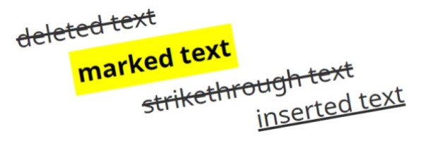
Bold, italic, underline
Appearance
Regular text
Regular text plus bold text
Regular text plus italicized text
Regular text plus underlined text
HTML code
<p>Regular text</p><p>Regular text plus <strong>bold text</strong></p><p>Regular text plus <em>italicized text</em></p><p>Regular text plus <u>underlined text</u></p>
Correct use
- Use bold for emphasis to highlight certain words, phrases, or numbers
- Use bold sparingly; the more you use it, the less effective it is
- Use italic sparingly for short sections of text
- Use italic for branded trademarks, such as Interac®
- Follow Writing Tips Plus rules for using italic:
- French and foreign words
- Latin terms and abbreviations
- Legal references
- Mathematical, statistical and scientific material
- Titles of works
- Do not italicize multiple hyperlinked titles of publications if they appear together in a list
- Use underline only for link text
Incorrect use
- Don't combine styles, like underline and bold , unless it's part of the hyperlinked text on a topic page
- Don’t italicize or bold an entire line or body of text as this makes it harder to read
- Don't use italic:
- for design or decorative purposes
- to emphasize a word or phrase (use bold sparingly instead)
- for long passages of text, such as quotations
- in page titles
- Don't underline text that is not a link as it mimics the visual appearance of a link and can cause usability problems
Alignment
Use to align text to the left, centre or right.
Centered and right aligned text both have a "ragged" left edged which has been shown to impede reading speed and comprehension. The straight (or “hard”) left edge and ragged right edge combination of standard left aligned text performs best for readers because it helps the eye find the start of the next line when it leaves the end of the last one.
Appearance
Your text...
HTML code
<p class="text-lefttext-centertext-right">Your text...</p>
Correct use
- Center or right align table data cells to mimic accounting tables
Incorrect use
- Do not use to align non-text information
- Avoid using it, unless it adds value to the content.
Sizing
Use to override the global default font size of 16px, with a line-height of 1.428.
Appearance
Default size text
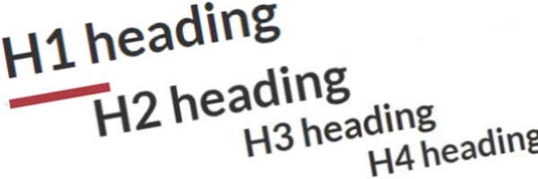
H1 size text
H2 size text
Lead size text
H3 size text
H4 size text
H5 size text
Small size text
HTML code
<p class="h1">Size H1</p><p class="h2">Size H2</p><p class="h3">Size H3</p><p class="h4">Size H4</p><p class="h5">Size H5</p><p class="lead">Size lead</p><p class="small">Size small (CSS)</p>
<small>Size small (element)</small>
Coding considerations:
- Use the
.smallCSS to style text and reduce it in size and impact - Use the
<small>element to define small text, for example side-comments, disclaimers and "fine" print, including copyright and legal text
Correct use
- Use appropriate semantic markup
- Changes in text size can convey information
- Use when you need to add or reduce impact to text that isn't an actual heading
Incorrect use
- Do not use in place of actual headers
- Do not use small text simply to squeeze a lot of text into a small area
- Consider breaking the text into smaller blocks
Colour
Appearance
This is your coloured text.
This is a coloured icon:
HTML code
<!-- Text colour  -->
	<p class="text-mutedtext-infotext-primarytext-successtext-warningtext-danger bg-info bg-primary bg-success bg-warning bg-danger">This is your coloured text.</p>

	<!-- Icon colour  -->
	<p>This is a coloured icon: <span class="fa fa-adjust text-muted text-info text-primary text-success text-warning text-danger"></span></p>
Coding considerations:
- Wrap text in a
<span>tag if a style does not appear as it is meant to, due to specificity reasons
Correct use
- Use colour as a presentation element for either decorative purposes or to convey information
Incorrect use
- Do not use colour as the only way to communicate information or intent, as colour alone is not accessible
- Avoid using colours unless they add value to the content
Choose the right colour
- Muted
(gray) -
- Use to de-emphasize text (make less obvious)
- Info
(light blue) -
- Use to style fairly important information
- Primary
(dark blue) -
- Use to match text to the main colour palette of the site
- Success
(green) -
- Use to suggest that the content is correct or the right way of doing something
- Warning
(yellow) -
- Use to call attention to the content and warn the user of something
- Danger
(red) -
- Use to call attention to very important content, and advise the user that an action is dangerous
Wrapping and truncating
Use to prevent text from wrapping to the next line.
Appearance
This year's deadline to filing your taxes is April 30, 2021.
HTML code
<p class="wb-elps">This year's deadline to filing your taxes is <span class="nowrap">April 30, 2021.</span></p>
Wrap
Correct use
- Use to control where and how words wrap within a line of text
- Use to prevent content such as telephone numbers, postal codes, mathematical equations, dates and French punctuation (colons, brackets and so forth that require spaces) from wrapping over multiple lines
- Remember that the page is responsive to the width of the browser
- Text wraps at different points on different devices and viewports
- Be sure to suit the different resolutions
Incorrect use
- Do not use to wrap complete sentences
- Do not use for non-text information
Truncate
Correct use
- Use to truncate text to fit within a grid column on a single line. Any text beyond the grid border will be cropped and replaced with an ellipsis (three dots)
- The text only disappears visually, and it can still be read by screen readers
- Use primarily for hyperlinks to prevent word wrap (if height is a concern and equal height (equalize) cannot be applied) or if it displays outside of a grid columns (when wrap is applied)
Incorrect use
- Do not use this styling for sentences, as it can hide information to a visual user
- Do not use in place of equal height (equalize) when trying to achieve equal height on a grid row
Complementary components
Additional add-on features and behaviours are available.
- Date modified: